Complementary Theme Styles
This documentation is part of the Frontend Development category, designed to guide you through frontend customization within Simplicité.
This guide covers advanced theme customization using the addon.less file to extend or override styles defined in constants.less and theme_gen.css.
What is Less?
Less (Leaner CSS) is a CSS preprocessor that extends CSS with:
- Variables: Reusable values:
@primary-color: #3498db;
body { color: @primary-color; }
- Nesting: Hierarchical styles:
.container {
  .header {
    .box { background-color: red; }
  }
  .body > .box { background-color: blue; }
}
- Interaction States:
.box {
  background-color: yellow;
  &:hover { background-color: orange; }
  &:active { background-color: red; }
}
- Mixins: Reusable style blocks:
.rounded-corners(@radius: 0.5rem) {
  border-radius: @radius;
}
div { .rounded-corners(1rem); }
- Functions: Dynamic calculations:
@primary-color: #3498db;
body { color: darken(@primary-color, 16%); }
Only use addon.less when Simplicité's built-in customization options are insufficient. Overusing it can complicate maintenance.
When to Use addon.less
Use addon.less only for requirements that cannot be fulfilled through:
- Theme Editor settings
- Standard CSS properties
- Simplicité's native customization features
Common use case: Adding custom colored borders to UI elements for brand compliance.
Customization process
1. Locate DOM Elements
Use one of these methods:
Method 1: Theme Editor's Path in DOM feature for elements in the Preview
Method 2: Browser inspector for elements outside Theme Editor
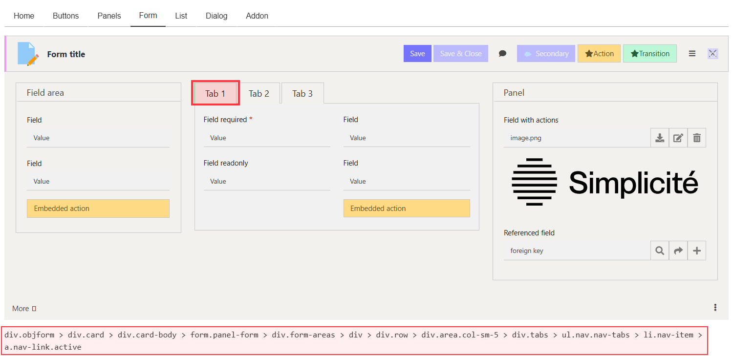
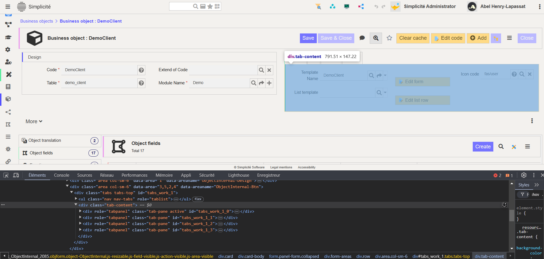
2. Identify Context
Document the element's:
- Classes
- Parent containers
- Related elements
This prevents unintended styling of other UI components.
3. Implement Styles
Add styles to addon.less:
// Define color variables
@border-pink: #EC9DED;
@border-blue: #5451FF;
@border-green: #58EC9B;
@border-red: #FB3640;

// Target panels and sub-panels
div.card {
  div.card-header {
    border-left: solid 0.2rem @border-pink;
  }
  div.panel-card > div.card {
    div.card-header {
      border-left: solid 0.2rem @border-blue;
    }
  }
}

// Target tabs
div.tabs-top {
  div.nav-tabs > div.nav-link.active {
    border-left: solid 0.2rem @border-green;
  }
}

// Target lists
div.container-table > table {
  thead {
    border-left: solid 0.2rem @border-red;
  }
}
If styles don't appear immediately, add !important to ensure they override default styles. Remember to clear your cache.
Example: Interactive list rows
Add visual feedback for selected rows:
@border-red: #FB3640;
@border-yellow: #FFD166;

div.container-table > table {
  thead {
    border-left: solid 0.2rem @border-red;
  }
  tbody > tr.list-clickable {
    border-left: solid 0.25rem transparent;
    &.selected {
      border-left-color: @border-yellow;
    }
  }
}
Applying your theme
- Navigate to User Interface > Views > Home Pages
- Select your view
- Apply your custom theme
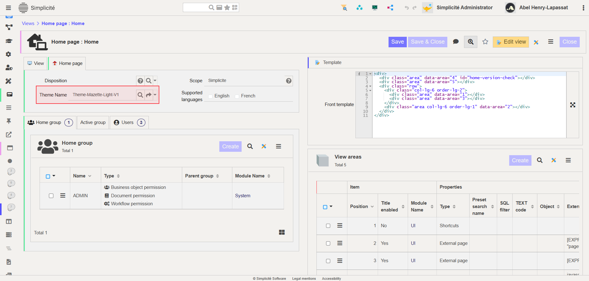
- Clear cache to see changes