Create compliant applications with Simplicité
Introduction
This guide helps designers build Simplicité applications that meet the RGAA. It describes the tools the platform provides to reach compliance, the platform-wide points that depend on your choices, and the settings that a strictly compliant application requires.
It is meant to be used alongside the platform: keep it open while you configure your application.
Platform features
| Feature | For | Purpose |
|---|---|---|
a11y-mode | End users | Runtime switch to the most RGAA-compliant version of the platform |
ACCESSIBILITY_OVERRIDE | End users | Fine-tune which adaptations a11y-mode applies |
ACCESSIBILITY_DEV | Designers | Show the compliance status of each feature while you configure it |
ACCESSIBILITY_LEVEL | Designers | Declare the accessibility level of your application |
Runtime a11y-mode
End users toggle Accessibility Mode from the .btn-a11y-mode button in the application header.


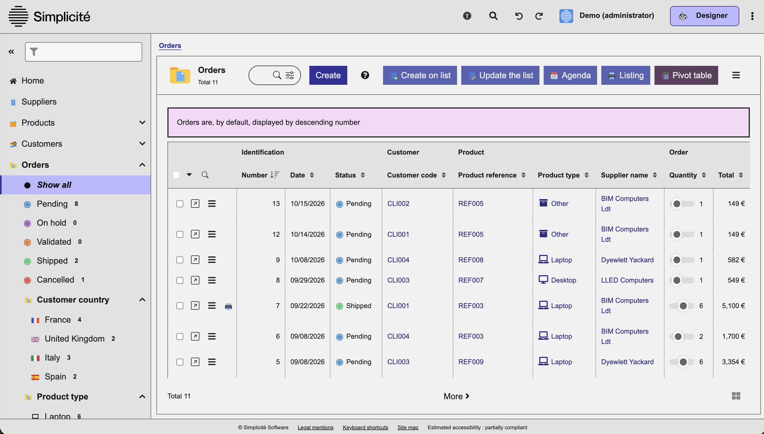
Some core behaviors cannot be made compliant without degrading the comfort of users who do not need
them. a11y-mode adapts or disables them all at once, which makes it the most RGAA-compliant version
of the platform: in an audit, only use with a11y-mode on is guaranteed compliant for core elements.
| Behavior | What a11y-mode does |
|---|---|
| Custom colors of action buttons and states | All custom colors set on action buttons with the act_bg_color and act_color fields (Action form) |
| Horizontal menu | Forces all domains to be rendered on the left, disabling any obd_menu set to T. |
| Splitting the work area into resizable panels | Forcing the mono-area for the #work, and disabling the btn-ui-splitter so work-areas cannot be triggered. |
| Compact mode | Forcing the default compact setting (removing compact from the body), disabling the zoom-compact toggle. |
| Mosaic display of lists | Disabling all btn-minifiable in the lists panel-footer. Making them non-clickable when in a11y-mode. |
| Trays (trello) and metrics of status-based objects | Removing the statuses objects "Trays" (status-tray) and "Metrics" (status-metrics) entries from menu. |
| Predefined searches offered in the search dialog | Disabling the predef button from the search modal. |
| Date pickers | Removing all datetime pickers from fields and filters. Replacing them with a textual hint with proper formatting. |
| HTML input fields | Rendering all "complex" html fields as plain textarea, removing the specific features (linting, formatting, etc), but still allowing their usage. |
Forced HighContrast theme | When in a11y-mode, switches the theme to be HighContrast (requires few settings to be effective, see A11y-mode settings) |
| Opening a form per table row | Replaces the form-opening behavior from clicking on a row to an action button in the col-action of every row. |
| Default display of linked objects | Forces the objlinks display to be objlinks-flow, and disables the btn-options dropdown/action. |
a11y-mode is a safety net: it does not make Non-Compliant features compliant. Under strict
requirements, disable them at design time, whether or not users turn the mode on.
User ACCESSIBILITY_OVERRIDE parameter
a11y-mode is all-or-nothing, so that it can reach full compliance. Users who do not need some of its
adaptations, or who want to keep some features anyway, can override it behavior by behavior with the
ACCESSIBILITY_OVERRIDE user parameter. Each key takes true or false:
{
  "customcolors": false, // custom colors of action buttons and states
  "menutop": false,      // horizontal menu
  "workareas": false,    // splitting the work area into resizable panels
  "trays": false,        // trays (trello) of status-based objects
  "metrics": false,      // metrics of status-based objects
  "datepicker": false,   // date pickers
  "htmledit": false,     // HTML input fields
  "codeedit": false,     // code editors
  "highcontrast": false, // forced HighContrast theme
  "clickablerow": false, // opening a form per table row
  "flatlinks": false     // default display of linked objects
}
Each overridden behavior falls back to its standard, potentially non-compliant version for that user.
Compliance statuses
The same vocabulary is used by the ACCESSIBILITY_DEV icons, by the fld_compliance field and across
this document.
| Status | Icon | fld_compliance | Meaning |
|---|---|---|---|
| Compliant | green | C | Use freely. The feature meets the RGAA tests and WAI-ARIA rules. |
| Partially Compliant | orange | PC | Usable, but only with the settings given in its help popup (fld_compliancehint). |
| Non-Compliant | red | NC | Do not use under strict compliance requirements. |
| Not Evaluated | grey | NE | Not assessed yet. Avoid under strict requirements. |
| Not Applicable | none | NA | The feature has no bearing on RGAA compliance. |
Designer ACCESSIBILITY_DEV sysparam
Set the ACCESSIBILITY_DEV system parameter to yes for the whole design phase. Every setting in the
configuration forms then shows an icon next to its label, giving the
compliance status of the related feature where you make the choice.
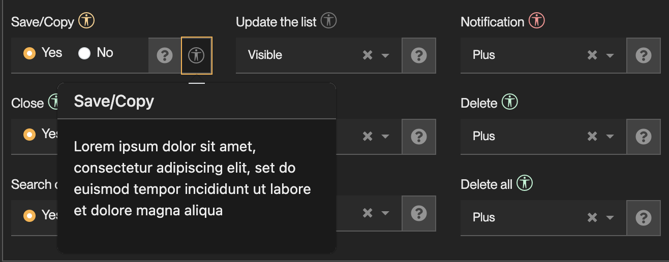
- No icon: the feature has no bearing on RGAA compliance.
- Grey icon: not evaluated yet. Treat it as Non-Compliant under strict requirements.
- Red / orange / green icon: Non-Compliant / Partially Compliant / Compliant.
- On orange icons, a help popup lists the settings and precautions required to use the feature compliantly.
Accessibility declarations
Once your application is built, declare its accessibility level with the ACCESSIBILITY_LEVEL system
parameter. It is displayed in the application footer.
{
  "audit": false,
  "score": 60
}
audit:falsefor an estimate by your team, the footer then reads Estimated accessibility.truefor the result of an official audit, the footer then reads Accessibility. Without an audit, the law forbids claiming a guaranteed level.score(0 to 100):100is labelled Fully Compliant,50and above Partially Compliant, below50Non Compliant.
The example above displays Estimated accessibility: partially compliant.
Platform-wide considerations
These are not settings to apply, but things to know about the platform as a whole: where its compliance ends, and where it depends on your design choices or on your end users. Keep them in mind across the whole application.
Themes and contrast
The HighContrast theme, shipped with the platform in light and dark variants, is the reference
compliant theme. It is the theme a11y-mode forces, whatever theme the application uses otherwise.
Colors are fully variabilized. If you create and use a custom theme, the platform can no longer guarantee the criteria on colors, contrast and shapes: validate every color with the built-in contrast checker available at each customization point.
Themes do not change the layout. If your custom theme does (custom CSS on sizes, spacing, positioning, etc.), the platform can no longer guarantee the criteria on presentation and readability either.
Criteria whose compliance relies on the HighContrast theme:
- Colors: 3.2 and 3.3, contrast of texts and of interface components;
- Presentation of information: 10.6, visibility of links, and 10.7, visibility of the focus.
A custom theme that changes the layout also puts the rest of theme 10 at stake (text resizing, information given by shape, size or position, reflow).
Custom HTML
Several extension points let you inject markup the platform does not control: static texts, field help content, publication templates, JavaScript addons and external objects. Plain text is always safe. As soon as you write HTML, its compliance is entirely yours - see the resources for the WAI-ARIA rules to follow.
External objects are the extreme case: their markup is written in free code and cannot be checked at all by the platform.
Images
Each image exposes two user-editable texts:
alt, its text alternative;longdesc, a detailed description attached to the image as screen-reader-only text, and visible to everyone whilea11y-modeis on.
The platform provides the mechanism, but compliance depends on end users writing accurate texts, or explicitly marking images as decorative. Say so in your application's own user documentation.
Charts: the platform's default Crosstab component is compliant, as it always offers a table alternative to its charts. Other charts (ChartJS in external objects) are not: provide an accessible alternative yourself (data table, textual summary). The same goes for diagrams and infographics.
Languages and translations
The platform provides a translation system, but not multilingual content: an application displays one language at a time, and changing the language switches the whole application.
Use the translation system properly: criteria requiring relevant labels, titles and alternatives are only met if every text is translated in the active language. An untranslated text produces a change of language the platform cannot declare in the markup.
Values entered by users (inputs, social posts, chats, etc.) cannot be detected as another language when they are. Their language change cannot be declared either.
Component guides
Mandatory settings
Settings for a11y-mode
In order to enable the a11y-mode and its overrides, there are few things to enable within your applications :
- associate the user parameter
ACCESSIBILITY_OVERRIDE - create a Scope theme to link the
HighContrasttheme to your scopes.
Settings for strict RGAA requirements
For applications that have very strict RGAA requirements, or if the gap between a11y-mode and regular usage needs to be shortened.
| Setting | Value | Why |
|---|---|---|
TODO | TODO | TODO |
Good practices
Appendix: keyboard accessibility
This reference is worth copying into your own application's user documentation: end users have no other way of discovering these shortcuts.
Global
| Keys | Action |
|---|---|
TAB | Focus the next element in DOM order |
SHIFT + TAB | Focus the previous element in DOM order |
ESC | Close, by priority: the focused field or rich editor, then all modal dialogs, then the current form. Navigates back when nothing is focused |
ALT + H | Display the Home page |
ALT + M | Focus the main Menu, on the last selection or the first item |
ALT + W | Wide screen, toggling the menu |
ALT + B | Open the Bookmarks dialog |
ALT + F | Focus the Finder, the global search in the header |
ALT + L | Focus the first visible List |
ALT + N | Focus the Next visible area or list, on the first .js-focusable element |
Menu
| Keys | Action |
|---|---|
ALT + M | Focus the main menu, on the last selection or the first item |
RIGHT / LEFT | Open / close a domain or a sub-menu |
UP / DOWN | Previous / next menu item |
ENTER | Open the item, list or view, or launch a business process |
Lists and forms
Horizontal navigation, after a search:
| Keys | Action |
|---|---|
SHIFT + LEFT | Previous record on a form, previous page on a list |
SHIFT + RIGHT | Next record on a form, next page on a list |
CTRL + SHIFT + LEFT | First record on a form, first page on a list |
CTRL + SHIFT + RIGHT | Last record on a form, last page on a list |
Vertical navigation within a page of a list:
| Keys | Action |
|---|---|
UP / DOWN | Move across table rows: header row to focus columns and sort fields, search row to filter, then the records of the current page |
TAB | Visit the focusable cells of a row. Long texts, markdown content and textareas are focusable so they can be scrolled with the arrow keys |
ENTER | Open the record, when form access is granted for that row |
Designer shortcuts
Shortcuts can define further access keys.
| Keys | Action |
|---|---|
ALT + I | XML import page |
ALT + C, then C | Clear all caches |
ALT + X | Open the script / code editor |
Resources
- Our position on the RGAA criteria - the platform's verdict on each of the 106 criteria, and what is expected of you as a designer.
- Using ARIA
- ARIA in HTML
- ARIA Authoring Practices